
auri is royalty
Despite how anyone else is moving, we strive to move as kings and queens over here. Check out our new royal emblem. See if you caught all the elements of the design:
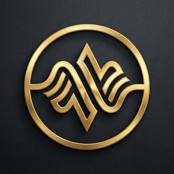
1. The Visual Construction
The Weave: The central figure is formed by interlocking gold ribbons. They flow like audio waveforms (representing AURi Radio and Talking Heads) but are solidified into a hard, architectural structure. This visualizes our motto: “Where real life meets real change.”
The Upward Apex: Notice how the center of the design creates a sharp, upward-pointing peak or "arrow." This represents Growth, Scale, and Evolution. It is visually lifting the eye upward, symbolizing the elevation of independent artists.
The Infinite Loop: The lines appear to fold into themselves, mirroring our Ecosystem Model ("Everything feeds everything"). There is no beginning or end; the Radio feeds the Fest, which feeds the Magazine, just as these lines feed into one another.
2. The "Empire" Connection
The Seal: By enclosing the dynamic shape within a perfect Gold Circle, it creates a "Stamp of Approval." It feels like a coin or a wax seal. This adds the authority and legitimacy. It says, "This is established. This is premium."
The Texture: The brushed gold against the matte black background signals High-Margin Luxury.
3. The Rorschach Test (Hidden Meanings)
The Pulse: It looks like a heartbeat on a monitor—the "Pulse of the Culture."
The Crown: The top silhouette vaguely resembles an abstract crown, fitting for a brand building a kingdom for creators.
Well kings and queens, what do you think? Did we nail it? Comment below. Merch coming soon!